
We analyzed search data from around the globe to compile our annual Color Trend report, and this oceanic pink is gaining traction.
The results results are in from our annual Color Trends report, and it turns out Pacific Pink—a nostalgic, vintage-inspired hue with a wistful, romantic character—is set to make waves in 2022. The dusty rose color, which brings to mind the hue of pressed flowers, has more versatility than hot pink and more depth than millennial pink.
Scroll down to learn more about the shade—and discover ten free Pacific Pink color palettes while you’re at it.
 Image via Tania Peresadko.
 Image via Alexei Vladimir.
You can also discover a spectrum of beautiful colors to use in your designs with our new color tool.
Introducing Pacific Pink
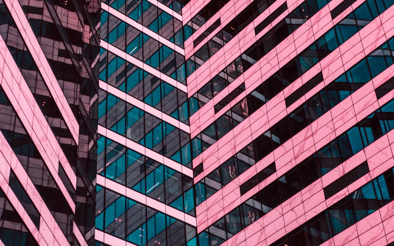
Dusky and deep, Pacific Pink has an old-world quality reminiscent of dried flowers, quiet sunsets, or the whimsical set of a Wes Anderson movie.
It takes its name from its gentle coastal personality, with a shell-like hue evocative of glimmering Pacific beaches.
 Images via Tefik rustemov, VladKK, wee dezign, and BAZA Production.
When combined with bolder shades, such as teal or aqua blue, it takes on a more modern mood, bringing life and dynamism to web banners or social media posts.
 Images via Light Stock, Chones, Nik Fox, and Ulada.
Where Is Pacific Pink on a Color Wheel?
Although pink, being a tint of red, doesn’t feature on a traditional painter’s color wheel, it’s often nestled between red and mauve on more contemporary wheels.
As a dusty pink shade, Pacific Pink contains a small dose of violet, which lends it a slightly more subdued mood than more vivid pinks.
Quite the opposite of somber, however, violet provides a subtle vivacity, giving this warm and cosseting pink a distinctly nostalgic and old-fashioned character, making it feel timeless and classic.
 Color wheel image adapted from contributor Antun Hirsman.
Pacific Pink’s Complementary Color
Being a tint of red, pink would sit opposite pale or lime green on a color wheel. However, given that Pacific Pink contains a dose of violet, making it a slightly darker and cooler pink, it shifts towards the redder side of the spectrum.
Red’s complementary color is green, so it makes sense that Pacific Pink is complementary to greener blues, particularly pale teal.

Pacific Pink’s Analogous Colors
An analogous scheme uses the colors bordering pink on either side of the color wheel. On a contemporary color wheel Pacific Pink is bordered by red and mauve, which can be used to create a subtle, graduating color scheme.
You can also branch out one step further and bring Velvet Violet and deep midnight blue into the mix for an analogous scheme with more variation.

Pacific Pink’s Triadic Colors
A triadic scheme includes colors that sit across from Pacific Pink in a equidistant triangle on the color wheel. Blue and golden yellow are the perhaps unexpected triadic companions to Pacific Pink, which creates an oceanic-inspired scheme.

The Meaning and Psychology of Pacific Pink
Pink is a surprisingly complex color with a conflicted history of meanings and associations. Up until the early twentieth century, pink was considered a masculine color, which may have stemmed from the fact that it’s a tint of red (long associated with male virility and aggression), and was a common color worn by boys and young men. It still retains some of this association when used as a sporty, preppy color for men’s clothing.
Later in the twentieth century, pink became more strongly associated with femininity and children, and is one of the few colors that remains broadly gender-specific in popular culture.
It’s also symbolic of kindness, compassion, love, and romance, and is frequently used in connection with branding for charities, hospitals, and female-targeted businesses.
Think Pink! Discover the Design Power and Symbolism of the Color Pink
Luckily, pink is starting to shed its outdated feminine associations, with the popularity of Millennial Pink signaling a strong shift towards pink as a color that has generational rather than gender-specific affiliations.
Pink is the color of social media, gender fluidity, and activism, rather than limited as the color of menstrual products or nurse’s uniforms.
 Image via BAZA Production.
Pacific Pink represents the next step from Millennial Pink, being a deeper, darker, and generally more mature take on a rosy hue. With its dose of violet, this dusky hue has a grounding and rounded character that makes it feel less flamboyant and frivolous than bolder or paler pinks.
This rich pink can be used as an atmospheric, flattering color for a range of projects, and it also acts as a versatile neutral tone when teamed with accent colors such as turquoise, emerald green, or teal.
 Image via Lena Nester.
Pacific Pink has an old-fashioned, tea rose character when used in isolation, making it a vintage-friendly hue to pair with typewriter fonts or sepia-tinted photography, particularly for wedding stationery.
Teaming Pacific Pink with blues or greens really helps to pull this classic rosy hue into 2022, balancing its warmth and cocooning stability with a cool and refreshing energy.
Data-Backed Ways to Think Pink for Your Next Campaign
How to Design with Pacific Pink
Pacific Pink is an adaptable pink that can be used effectively across a wide variety of design projects. Applied in isolation, it gives a distinctly vintage feel to layouts, graphics, or illustrations, and has a sedate mood that helps viewers feel calm.
It’s a natural fit for designs that need to appear both approachable and mature, such as wedding invitations, informational posters, or signage.
As a versatile, deep pink, Pacific Pink is able to take on some of the characteristics of other colors when used in combination. You can add a more conservative element to a scheme by pairing it with charcoal, midnight blue, or bottle green, as is demonstrated in the brand identity for law firm Pro et Contra below.
 Brand identity for law practice Pro et Contra created by Ukrainian creatives Orchidea Agency.
When teamed with other dusky or muted hues, such as peach, brown, or apricot, Pacific Pink takes on a distinctly vintage character. Throw vintage-inspired typefaces and illustrations into the mix and a Wes Anderson aesthetic is yours.
 A vintage-inspired identity for Louie Restaurant by Violaine & Jeremy.
 Menus which wouldn’t look out of place at The Grand Budapest Hotel are given a vintage feel with Pacific Pink. Identity created by Violaine & Jeremy for Mamie Restaurant.
In interior design, Pacific Pink offers warmth and style in equal measure. Team with other warm hues, such as red or coral for the ultimate comforting space, or pair Pacific Pink accents with warm wood and mink gray for an ultra-sophisticated and vintage-tinted effect.
 Image via ImageFlow.
 Image via Followtheflow.
Pacific Pink: 10 Color Palettes to Discover and Inspire
Bring out the different sides of Pacific Pink’s diverse personality with these ten on-trend color schemes for 2022. Whether it’s a fresh coastal-inspired palette or a cocktail-worthy mix of juicy shades, there’s something here for every type of project.
Scroll down to discover ten FREE Pacific Pink palettes, and save your favorites to a Pinterest board or your computer.
1. Jade Coast
Amp up the impact of your designs with this coastal-inspired scheme, combining Pacific Pink with complementary green teal and dark maroon for extra depth. This warm and cool palette lends Pacific Pink a fresh and earthy mood.
 Image via Radu Bercan.
2. Charcoal Rose
Dark, gothic colors are the most stylish foil to Pacific Pink’s rosy innocence. Here, dark charcoal, slate gray, and silver gray help to create a chic scheme that would suit interior design or more formal brand identities.
 Image via Anastasiia Popova.
3. The Influencers
If you’re looking for an eclectic aesthetic, this Wes Anderson-inspired palette will help to bring an eccentric touch to your design projects.
Cherry red, pastel purple, and cyan blue are unexpected and fun-loving companions to Pacific Pink’s understated elegance.
 Image via andersphoto.
4. Pink Lady
Create the cocktail for the perfect color palette with this delectable scheme. Peach and coral red sit naturally alongside Pacific Pink, bringing sunset warmth, while lime green provides a refreshing accent hue.
 Image via FREEPIK2.
5. Grand Pacific
Cyan Blue gives a fresh aspect to this all-pink palette, which graduates from pale powder pink to deep fuchsia. This palette has a vintage feel without feeling stuffy, making it a good choice for designs that require a subtly nostalgic mood.
 Image via Katya Havok.
6. Dusky Deco
Forest and bottle green make elegant partners to Pacific Pink, giving designs a sophisticated, old-world feel. Teamed with metallic or non-metallic gold, the scheme is elevated to luxurious levels. Use in interior design, fashion, or high-end branding for effortless polish.
 Image via Photographee.eu.
7. Daiquiri Sunset
This sunset-soaked triadic palette is heady and seductive, combining rich tones of neon fuchsia, electric blue, and egg yolk yellow. Try using this palette as part of a gradient background to really make the most of its sundown style.
 Image via Nature Peaceful.
8. Wistful Wildflower
Pale grass green and cornflower blue play up Pacific Pink’s nostalgic and delicate side in this wistful scheme. This pretty palette would be a good match for wedding stationery or lifestyle packaging.
 Image via sundreamz.
9. Cameo House
This earthy scheme combines Pacific Pink with ochre brown, deep racing green, and pale crimson for a grounded effect. Use this palette for sustainability-themed designs to create a down-to-earth but impactful aesthetic.
 Image via Elusive Edamame.
10. Baroque Blush
Faded decadence is the inspiration for this graceful palette that combines Pacific Pink with other vintage hues of rich purple, rosewood, and chartreuse. An unusual and elegant scheme with enigmatic appeal.
 Image via IrenaStar.
Ready to discover more trending colors to use in your designs? Find your next favorite color scheme with our new color tool that helps to bring your web and print projects to life.
We see the world in color. Delve into the fascinating psychology, origins, and design applications of these colors:
2022 Color Trends Report: SerenityLush LavaTidewater GreenHoliday NeonPastel Colors
Cover image via Lena Nester.
The post Introducing Pacific Pink, One of 2022’s Trending Colors appeared first on The Shutterstock Blog.
Read more: shutterstock.com